The Psychology of Color in Web Design
Explore how different colors influence user behavior and emotions, and learn how to choose the right colors to create engaging and effective web designs.
4 min read · Jun 3, 2025
Color is more than just a visual element in web design; it plays a crucial role in shaping user perceptions and influencing their behaviors. Understanding the psychology of color can help you create more effective and engaging web designs. This article delves into how different colors impact emotions and actions, and offers tips on selecting the right colors for your website.

The Basics of Color Psychology
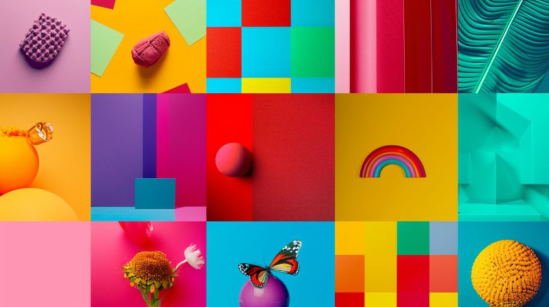
Color psychology studies how different hues affect human behavior and emotions. This understanding is essential in web design, as the colors you choose can influence how visitors perceive your site and interact with it.
- Warm Colors: Red, orange, and yellow – typically evoke feelings of energy, warmth, and excitement.
- Cool Colors: Blue, green, and purple – often associated with calm, trust, and professionalism.
- Neutral Colors: Black, white, and grey – used to balance and support other colors, often conveying sophistication and simplicity.

How Different Colors Influence Behavior
Red
- Emotion: Passion, excitement, urgency.
- Usage: Often used to grab attention and create a sense of urgency, making it ideal for calls to action or sales announcements.
- Example: A red button for "Buy Now" or "Sign Up" to encourage quick action.
Blue
- Emotion: Trust, calm, professionalism.
- Usage: Popular in corporate websites and platforms where trust and reliability are crucial, such as financial services.
- Example: Blue headers and navigation bars to convey stability and trustworthiness.
Green
- Emotion: Growth, health, tranquility.
- Usage: Frequently used in environmental, wellness, and finance websites to symbolize safety and prosperity.
- Example: Green check marks and success messages to indicate positive outcomes or actions.
Yellow
- Emotion: Happiness, optimism, caution.
- Usage: Used to highlight important information and create a sense of cheerfulness or urgency.
- Example: Yellow highlights for special offers or important updates to attract attention.
Purple
- Emotion: Luxury, creativity, wisdom.
- Usage: Often seen in high-end and creative industry websites to convey sophistication and innovation.
- Example: Purple accents in luxury product websites to enhance the perception of quality and exclusivity.
Black and White
- Emotion: Sophistication, clarity, neutrality.
- Usage: Black is used for bold, high-contrast designs, while white offers a clean, minimalist look.
- Example: A black-and-white color scheme for a modern, elegant website that emphasizes content.
Choosing the Right Colors for Your Website
Selecting the appropriate color scheme for your website involves understanding your brand, audience, and the message you want to convey. Here are some tips to guide your choices:
- Know Your Audience: Consider the demographics and preferences of your target audience. Younger users might respond well to vibrant, bold colors, while an older demographic might prefer more muted tones.
- Align with Your Brand: Your website’s colors should reflect your brand’s identity and values. Use colors that complement your logo and brand materials.
- Create Contrast and Readability: Ensure that text and background colors have sufficient contrast to be readable. This is crucial for accessibility and user experience.
- Use Color to Guide Action: Use contrasting colors for calls to action (CTAs) to make them stand out and drive user engagement.

Testing and Validating Your Color Choices
Once you've selected your color scheme, it's crucial to test and validate your choices to ensure they work effectively across different contexts and for all users.
Accessibility Testing: Always verify that your color combinations meet accessibility standards, particularly for text readability. The contrast between text and background colors should be sufficient for users with visual impairments. A color contrast checker can help you validate that your color choices meet WCAG guidelines.
Emotional Impact Assessment: Test your color choices with your target audience to ensure they evoke the intended emotions and responses. What feels professional to you might feel cold to others, while what seems energetic might appear overwhelming.
Cross-Platform Consistency: Colors can appear differently across various devices and browsers. Test your color scheme on different screens to ensure consistency in your brand presentation.
Conclusion
Understanding and leveraging the psychology of color can transform your web design, making it more engaging and effective. By choosing colors that align with your brand and resonate with your audience, you can enhance the overall user experience and create designs that not only look good but also drive the desired user behavior.